Is my magazine consistent throughout?

Do you think my magazine is suitable for the chosen genre?

Friday 15 April 2011

Evaluation of Music Magazine.

The main task we have been given is to create a front page, contents page and a double page spread for a new music magazine, must have a minimum of four images, all images and text have to be created by ourselves. I had to do some research into existing music magazines, I was to look at the conventions and see how they affect the reader and how they make the magazine look professional and appeal to a specific audience. A conventional music magazine uses pull quotes, large bold masthead, this helps the reader to identify the magazine, plugs are used to make giveaways and important information stand out so the reader notices them. I had to choose a target audience, I analyzed Metal Hammer magazine, Q magazine and Decibel magazine in order to complete my research.

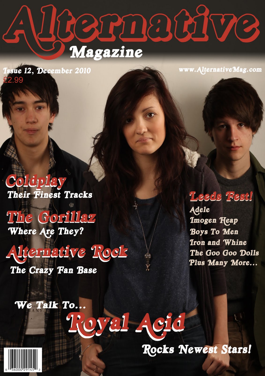
For my front cover, I wanted to have a red and black theme with white text, this was my initial idea, however, I adapted this by over lapping red and white together for important sub headings on the front cover and used white for the information. The font I used is called Royal Acid, this is similar to the “Rolling Stone” magazine font, I used this because I felt it looked vintage which is the area I wanted to touch with my magazine. For my splash I used a canon 550D in order to take a high quality picture, I connected it to a soft box light, this gives an ambient light effect and enhances the depth of field giving the focused point a higher quality and a much more professional look. I made sure I used a medium shot in order to get all of my subjects in close proximity and using up one third of the shot each, this allows us to see their emotions as well as being able to see the majority of the character in full. I chose to call my featured alternative rock band “Royal Acid” this is the name of the font I used for my masthead and sub information, however, it seemed also appropriate as a name for the band because alternative rock bands tend to have unusual names. I wanted to keep the date, price and website small so it didn’t take up a lot of space, but also large enough for people to be able to read it. I also decided to feature a festival band line up list on the right hand side, this fills the page but also gives people some informative information in case they were thinking of attending the festival.

I took a  number of photo’s in order to get a varied selection, the one I chose I felt was the best because the height of the three subjects was the same, they all had mutual or slightly gloomy faces, this fits the alternative rock genre quite well as the genre mainly focuses around blues and ballads. At first I wanted a strong dominant title so it stands out from other magazines, I had a very solid black background behind my text, however, I felt this was too much of a sharp contrast and I changed the gradient so it looked more of a smooth transition. The pull lines on my front page reflect the music genre, I did this so it would appeal to people who want to read about alternative rock, They are a large font and bold red with over lapping white, this stands out amongst the dark background, this means the reader can see what the cover says and gather the information easily.

I wanted my magazine to represent the teen to early adult age group, so I used three people for my main photographs, they are all 17, this means that the reader can relate to the people on the cover. My magazine represents teenagers who are interested or have a following towards Alternative rock, these individuals tend to have a random dress sense in which they like to call their own, this reflects my chosen target audience because these people seem to follow the individual dress sense in the same way that the artists do, people from other social groups see them as sad all of the time or depressed, so I’ve chosen a facial expression in my splash to represent this “depressiveness”. I’ve tried to attract my audience by featuring popular alternative rock bands such as Coldplay and the Gorillaz.

I believe my magazine would be published by an institution such as Bauer, this is because they publish such magazines as Kerrang and Q, these magazines are very similar to my magazine because they follow very similar artists and try to bring an excellent quality of news and information laid out in a professional style which makes it reader friendly and easy for the audience to consume.

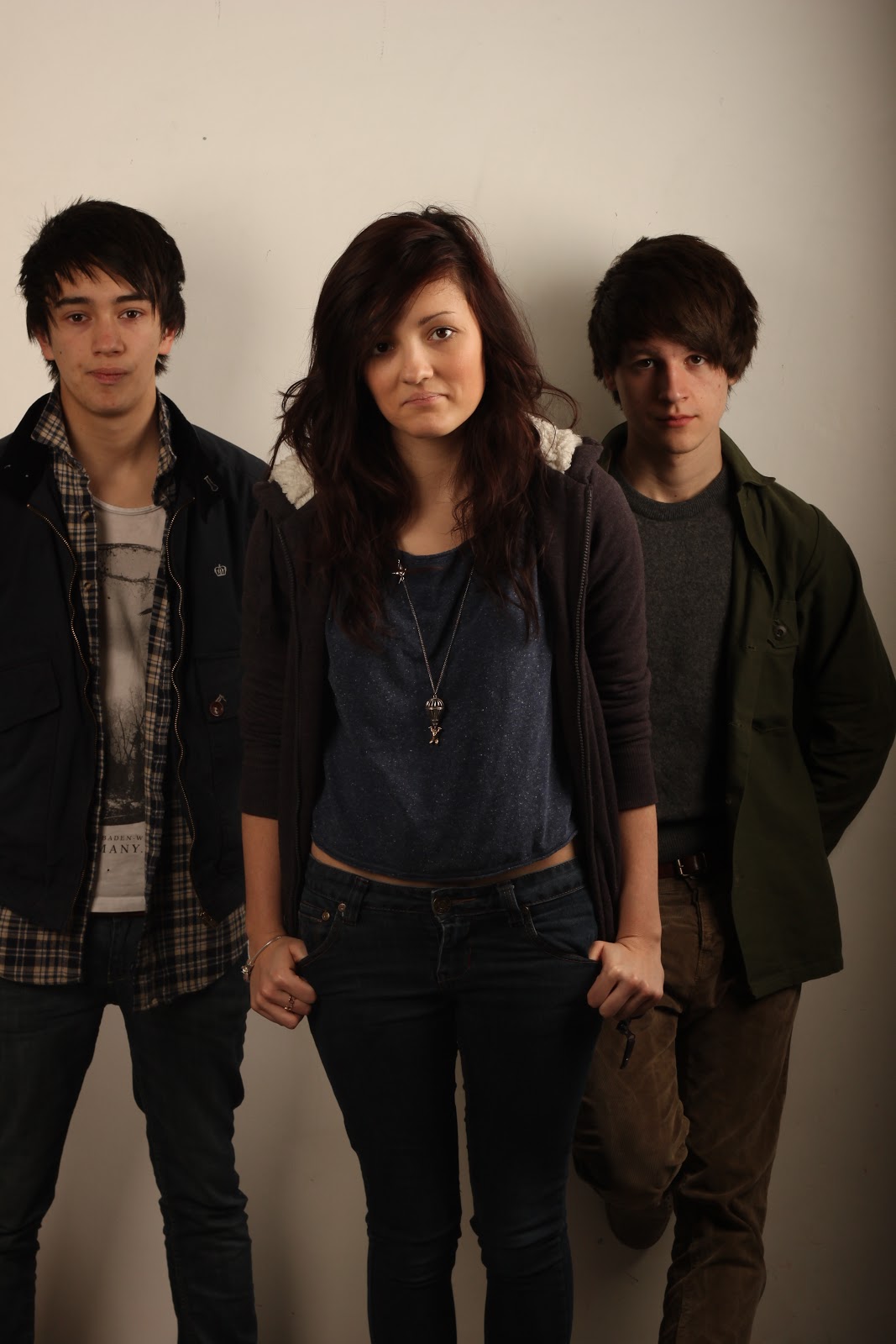
Moving onto my contents page, I kept the same theme of red and black I also used the same font for the masthead and the subtitles, this time however, I wanted to have a harsh contrast from the black and the red, this makes it easy to see and follows the house style, this also ensures continuity throughout the magazine. I decided I wanted to make a double paged contents page because it creates more space for a featured page as with the left side of my page which is a picture of “Royal Acid” the band on my front cover, however, there is only two band members in the photo because I wanted to make the it more interesting to look at rather than have the same picture again. The text is mainly on the right hand side, this lets the audience see “Royal Acid” first, this is because they are featured in the left third of the page and this is were the reader looks first. I used white text for the information so the page wasn’t all dark and gloomy.

I wanted to attract the reader more so I decided I would have a free giveaway of a Paolo Nutini album, this makes the audience want to read on, and possibly buy a magazine next time for more free giveaways, I placed a picture of “the one million dollar man” this gets people of all ages interested and then I captioned “how he did it”, this also makes people want to read on to find out what he did. I wanted my subject to pose with a big smile on his face to show that he was overjoyed with his achievements. I also used a picture for “The largest music collection EVER!” I needed this to be a smart looking youngster to reflect the individuality and thoughts of the young people, this relates to my audience by showing them how young people can achieve massive things too.

The image on the left of my contents page was again taken with a Canon 550D and connected with a soft box light for the same ambient glow provided in the front cover splash, I wanted my subjects to strike a cool relaxed pose in order to show that they are calm collective people, but I also placed a cigarette on my left subjects ear, this connotes rebelliousness and reflects the behaviour of the band members.

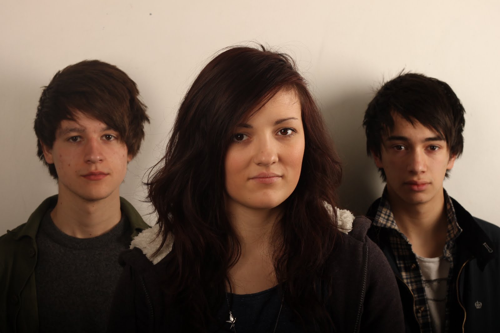
My double page spread follows the same technique regarding to taking the initial photograph, however, I wanted to have my subjects strike happier poses because they are telling us about their achievements with their band and what they hope to be doing later on in their career, I had one of my subjects face away, I felt this gave the impression that he was a less important member of the band and that he didn’t get to say much or have very much to say. This is also amplified by the fact that he is on the next page and cut off from the other two band members.

I decided I wanted a more clean look to my double page spread, and to achieve this I only used the red and white in the name of the band “Royal Acid” the rest of the text is written in Times New Roman, I feel this is a clean text that works well and makes easy reading for the audience. I chose to place a pull quote in the top left hand corner, again this is the first place that the reader looks when opening the page, it directly relates to a piece of text in the interview and I feel it’s interesting enough to make the audience want to read more about the band.

From taking on this task, I have learned how to utilise Photoshop in order to manipulate photographs and create a professional looking magazine Front cover, double page spread and contents page. Furthermore, from when I started the task to now, I realise that I have learned a great deal thanks to research of the media syntax, it has also made me realise just how much work goes into creating a music magazine.

Tuesday 14 December 2010

Double Page Spread Draft.


This was the original idea for my double page spread.

Contents Page Draft.


This was the original idea for my contents page.

Front Cover Draft.


This was the original idea for my magazine front cover.

Original Images.


I chose to use this for the featured part of my contents page because it fits very nicely on to A4 and it shows the rebellious nature of the band by having a cigarette in his ear.


I chose to use this image as my front cover because it was the most central portrait image and I felt the relaxed poses of the subjects reflected the feel I wanted to give to my magazine.


I chose to use this image for my double page spread because I felt that having the far right subject on the right page would look a bit more interesting rather than three on one page, also again, the posture and poses of the subjects reflect a cool collective nature.


Saturday 27 November 2010

Contents Page Reviews

Q Magazine January 2006


Language

The left hand side of the conents page has the general house style of "Q" magazine, it has the red highlights on the title of the page as well as the underlining and highlights of the contents themselves. The page contains two main images, they are numbered to show us which page we can find the information. Amost half of the magazine is black and white, this is for the photo, the photo of Cheryl Cole on the right hand side is in black and white because it shows class she is dressed in a sexy fashion and this appeals to men but it also appeals to women because they can get ideas from Cheryl Cole. The photo of Cheryl takes up a large amount of the page, this shows her importance to the issue, this gets people to notice her and want to find out what the fuss is about.


There is a small margin on the left hand side with some information in it, this will be showing whats in the magazine, it's placed on the left third of the page because it's the first place people look when they  begin to read the page, this means the info is there straight away. The house style helps this to work effectively, because it makes the text easy to read.


Institution


The institution for this particular magazine is Q, however the publishing house for Q is Bauer.


Ideology


Q like to make their contents pages attractive but also keep to the traditional house style so it's recognisable and reader- friendly.


Audience


The audience for this contents page will be the same as the whole magazine, generally older people but Q try to bring younger people into their magazine genre, and Q appeals to most people regardless of gender, social class etc...


Representation


Q prides itself on quality, the Q stands for Quality, this is what they try to represent in their magazines, in this contents page we have a clean layout, we also have the image of Cheryl Cole in black and white, this shows class, red is the colour of royalty, this again represents quality standard.


Q Magazine October 2008


Language

The left third of the contents page has the general theme for 'Q' magazine, the red box with the Q logo, all of the main contents are in the left third too, this is conventional as it's the first place, we the reader look when we open the page. we can see that there is a large amount of information on the left hand side, this works well and is layed out so it doesn't look cluttered and untidy. At the top right we can see the domain for the Q website and also the issue number and month the magazine is released. They have featured Oasis in the middle of the margin to the left, this features information about their tracks and other things. This appeals specifically to Oasis fans, but also people who are interested in finding out more. At the bottom third of the page we can see the regular features in the magazine and we can also see the review section of the magazine, the masthead and all of the sub-headings are higlighted and bold in order to make them stand out.

The image is the most dominant part of the contents page and really stands out above all the other information, this is the intention to catch the readers attention and get the message across, the band featured and the Courteeners, a pull quoote has been used "He's just showing off" Liams Fray's mum hits nail on the head. This gets people interested as to what the story is about and makes them want to read on. The band a positioned in the shot to give a dominant look, a low angle shot shows they're high up making them look tall and imposing, being on top of a high hill gives the impression that they are on top of the world and could suggest how they are feeling.

Institution

The institution for the contents page is 'Q', but 'Q' is part of a publishing house called 'Bauer'.

Ideology

'Q' try to keep their contents pages to the traditional colour theme, but they also try to keep the page clean, tidy and filled with quality information, Q stands for quality.

Audience

'Q' appeals mainly to older people, however they try to attract the younger generation by including music that appeals to a younger audience, they also aim to appeal to all audiences regardless of gender and social class.

Representation

'Q' try their best to provide a quality, reader-friendly magazine, this is shown in the contents page, the colour red represents quality and royalty, this is typical of 'Q'.


Metal Hammer July 2007


Language

The house style is the same throughout, the main colours used are black, white and red, these colours work well and allow the reader to see everything quite clearly due to the sharp contrast of the colours. The main featured content is placed in the left third, this is the first place the reader looks when they open the page and ensures all the featured content will be seen. The less important regular material is next to the featured. Below this is a plug for a company who review products, this is an example of synergy, two companies working together to promote one another, the plug keeps to the colour scheme of the house style. Below this is a promotion for two events, again this is an example of synergy.

The right hand side of the contents page is mainly made up of pictures, these have page numbers on so that people know where to find them, however, the pictures aren't annotated so the reader would probably have tro be a regular of Metal Hammer to know who the people are or a follower of the Metal genre. there are three plugs one for pagen 24, page 108 and page 78, these catch the readers eye and drag their attention to that element of the magazine. On the right third we have a paragraph from the editor of the magazine, this gets the readers interested and they know that they are having their thoughts listened to by someone.

Institution

The institution for this magazine is 'Metal Hammer' however the publishing house is 'Future PLC', it was founded in 1985, it's a special-interest publisher, this means when they make a magazine, it is focused around a certain target audience such as teenagers who enjoy gaming. they make a wide range of magazines, for example, they publish games magazines such as 'The Official Xbox 360 Magazine' technology magazines such as 'Mac Life' and even sports magazines such as 'What Mountain Bike'.

Ideology


Their ideology as stated on their website is to know their audience and their interests, every thing they make is to be edited to a quality standard and designed with excellence, unrivalled partnerships in every sector in which they operate and they are commited to operating in a way that is socially, ethically and environmentaly responsible.


Audience


The audience that this particular magazine is appealing to is teenagers to young men, aged around 16-25, and people who enjoy metal music. The magazine is also aimed at people who like "Avenged Sevenfold".


Representation
The representation behind the contents page mimics the front page, it represents heavy metal followers and artists, it shows them wearing their chosen clothing and their boyish, intimidating looks.


Friday 5 November 2010

Task 4: Front Cover Reviews: Metal Hammer Magazine, Decibel Magazine and Q Magazine.

Metal Hammer Magazine Front Cover, July 2010 issue.


Language


When looking at the masthead we can clearly see, the font is fuzzy and graffiti like, we can see this because there are slithers of paint like ink coming from the bottom of the text. This could represent the rebellious nature of the bands in this genre of music.


The splash is very relevant and of great meaning, firstly, the main focus of the image is the four band members themselves, for people who are unaware of 'Avenged Sevenfold' the original number of members was five, this included Jimmy 'The Rev' Sullivan, who passed away December 2009, this was obviously a great shock to the band. We can see that Jimmy's drum is in the centre, this could relate to the importance of him to his band memebers, the graffitti like picture on the wall is Jimmy himself, he has devil like wings, this connotates rebeliousness and also a dark side, this keeps the genre of his music alive, but also shows how he would have had a bit of a dark side, also on the picture we can see black and white rays coming from Jimmy, this again connotates his importance to the band and to his fans. Looking at the four band members, we can see that they are stood somewhat formerly, this shows respect towards their former band member, we can also see that the lead singer is sitting on Jimmy's drum and praying, this again shows respect and lets people know that he will not be forgotten. We can see that the band members are dressed in dark colours, wearing sun glasses and showing tattoo's, this is stereotypical of band members in this genre and resembles rebeliousness, it could also be seen that they are wearing sun glasses to show their emotion. The band are postured to look quite intimidating, this could represent that they are not push overs and don't obey the rules.


The general appearance of the cover is dark and gloomy, we can see that the important props such as jimmy's drum and the graffitti of jimmy on the wall are bright, this shows how he is remembered and how he will live on in their hearts, this also again shows his importance to the band and how he stood out.


As we look at the bottom of the cover we can see the band name in a bold white font, this stands out and attracts the readers attention, notice the angel like wings on the name, this is usually linked to the logo, but on this occasion they are attached to the text, this could be related to the subject of the front cover as jimmy is portrayed with angel wings.


Also at the bottom of the cover, under the band name, we can see the kicker it says "Our first thought was 'it's over'. It isn't. This is how Jimmy will live on." This is expressing the bands thoughts on the situation of Jimmy's death, however, this also foreshadows the ideas from the band to come.


The barcode shows the publisher "Future PLC" logo above it, it's also placed in the bottom left of the magazine, barcodes are generally placed in the bottom right.


Institution


The institution refers to the publisher. The publisher of this particular magazine is Metal Hammer, however the publishing house is 'Future PLC', it was founded in 1985, it's a special-interest publisher, this means when they make a magazine, it is focused around a certain target audience such as teenagers who enjoy gaming. they make a wide range of magazines, for example, they publish games magazines such as 'The Official Xbox 360 Magazine' technology magazines such as 'Mac Life' and even sports magazines such as 'What Mountain Bike'.


Ideology


Their ideology as stated on their website is to know their audience and their interests, every thing they make is to be edited to a quality standard and designed with excellence, unrivalled partnerships in every sector in which they operate and they are commited to operating in a way that is socially, ethically and environmentaly responsible.


Audience


The audience that this particular magazine is appealing to is teenagers to young men, aged around 16-25, and people who enjoy metal music. The magazine is also aimed at people who like "Avenged Sevenfold".


Representation


The representation of this magazine is the stereotypical heavy metal band, they are wearing a style of clothing that is popular to people who follow the metal music scene, three of the band members are wearing sun glasses, this could represent a cool laid back lifestyle amongst the hectic metal scene they are used to, they are positioned quite high up which looks intimidating and could be again representing the stereotypical metal listener.


Decibel Magazine Front Cover Issue, December 2006


Language


When looking at the magazine, we can clearly see that the main attraction in the band "Converge" who are the four subjects on the cover we notice that the band name is in bold white and is almost the same size as the title of the magazine, it's also at the front, unlike the magazine logo which is situated at the back and partly covered up by the lead members head, this is important because it shows the relevance that the band have to the magazine and to the people who are fans or read the magazine. The word "converge" means to come together, and as we can see the bands members are apart, but they are coming together. we notice that at the top of the front cover in bold "FREE!", this is highlighted by the black background contrasting with the orange writing, this catched the readers attention and makes us read on for the offer which is "Escapi music dvd inside" this helps the magazine to sell because people are getting something for "free".


The text is scattered around the page in different places, this is most likely to create space for the splash, that way we can see the four band members, this allows the magazine to sell to a particular audience who are fans of the band or people who are interested in finding out about the band.


The house style is somewhat consistant there is mostly blue, orange and white text on the cover, this looks attractive and is pretty eye-catching so that the reader can clearly see what the text says amongst the dark background. the text above the band name states "HERO WORSHIP" this is in a dark sketchy font, and is placed above the band name this could suggest that hero worship is either fading out, hense the sketchy dark colour, or that the band have hero worshipers.


We can see that the cover is pretty cluttered, there is text around the band members showing whats in the magazine for the reader, this takes the focus away from the band but promotes the mgazine by showing people what they will be reading if they are to buy it.


Institution


"decibel" is the institution for this particular magazine, interestingly "decibel" doesn't have a publishing house, decibel is well respected by the metal listening community and aim to produce the best magazine in it's genre, they don't have many competitors.


Ideology


The ideology of this particular magazine is to advertise the band "Converge" but also to advertise a number of things around the magazine to get the reader interested and create potential buyers. The ideology behind "decibel" itself, is to create the best heavy metal magazine for it's readers.


Audience


The audience of this magazine is those who enjoy metal music and people who have an interest in "Converge", the specific age, probably ranges from around 16-25.


Representation


This is generally a typical representation of a heavy metal band, they are wearing icon tee's which are usually non-brand name, this is typical of the heavy metal listener/performer. Three members out of four have quite long hair, this again is a general style of someone who likes heavy metal, they have tattoo's, this could represent their rebellious nature as people with tattoo's are stereotypical of rebelliousness.


Q Magazine Issue: February 2010


Language


When looking at this magazine cover, we can see that the subject Cheryl Cole is centered, the shot is an eyeline close-up, this particular shot is a close-up in order to show the facial expression of the subject, we can see that the text is spread out around the splash this allows us to see the subject more clearly, this allows us to see the expression she is looking sexy, she has "come to bed eyes" mouth slightly open, tongue out, she is heavily made-up and has bright red lipstick on, the rain on the cover creates a certain mood, she would be wet and wanting to get inside and cosy this appeals very much to men and would provide potential buyers for the magazine "sex sells".


We can see that the cover is very much cluttered with text around the border areas, this is typical of magazines and allows people to see what;s inside the magazine without opening the cover, this helps them to be able to buy the magazine without opening it to look for what to expect. The text on the top half, right hand side is in bold and different colours, this attracts the readers eyes and shows the importance of what it says. The left hand side of the magazine shows the "Q" logo at the top and has information regarding bands and events in text on the left side, the reader looks at the left side of the magazine first, this is why the important text is placed here.


What strikes us is the text towards the bottom, we can see "3 words... CHERYL COLE  R O C K S"
This is an exclamation and doesn't let the reader argue with what the magazine says, the text is centred and includes; italic, bold and capital spaced letters, this emphasises the importance of the text.


We can see towards the middle right of the cover a plug, this is circular and is advertising something about John Lennon inside the magazine, this will potentially persuade Lennon or Beatles fans to buy the magazine to find out the "untold stories and unseen pics".


Overall, the magazine is quite dark, and it's focussed around the splash, this is a typical convention of a magazine, the use of colours keeps to the house style of the magazine.


Institution


The institution for this particular magazine is "Q" however the publishing house is Bauer, which was created in 1986 with means to keep older music alive, they aim to set a superb standard of quality and the name "Q" stands for quality.


Ideology


The ideology behind this particular magazine is to entice people, especially males into buying the magazine, this is done by placing an attractive celebrity such as Cheryl Cole in this case on the front cover as we can see. The magazine also includes multiple pieces of information about various other bands etc... This helps to sell the magazine too.


Audience


The audience for this magazine is mainly males, however women would find this magazine appealing too. Probably around the age of 16-40, "Q" tend to aim for the older age, but they also try and get the younger generation involved. 


Representation


This magazine represents how females want to see themselves, most women would like to say they were as talented or as beautiful as Cheryl Cole, she is a role model for young women, but this also represents what most men want in a woman, very attractive and a strong will.

Wednesday 3 November 2010

Music genre

The music genre I have chosen to represent in my music magazine is alternative rock music, I have chosen this because I feel that the music in this genre appeals to a wide variety of audiences, this means a magazine in this genre would do very well because so many people will be interested in reading it. The quality of the music in this genre is excellent and the bands whom play this genre of music are usually liked by most people

Music Magazine LIIAR Breif

Language
The language relates to a number of elements, camera angle, camera position, camera distance, it also relates to what is placed in and around the magazine, the splash, masthead, kicker, plug etc... the house style of the magazine is also very important, if for example a magazine has a specific colour scheme, it would usually stick to that scheme because the readers can easily recognise the magazine in a shop. These are all important and make up the magazine, helping it to appeal to readers.

Institution
Institution refers to the publisher of the magazine, for example "Metal Hammer" is published by "Future PLC" this is known as a publishing house which creates as many magazines in as many genres to appeal to multiple audiences, this generates more income for the company.

Ideology
Ideology refers to the values of the company or the morals that they wish to follow, the company will try to keep to these standards in order to keep readers happy. The morals of "Future PLC" for example, are to know the interests of their audience and to design magazines to a quality standard.

Audience
Audience refers to the people who the magazine is aimed at, this can relate to age, gender, social class or interests etc... 'metal hammer" for example would be aimed at people around 16-25, majority a male audience, and people who enjoy metal music.

Representation
Representation refers to what the music magazine is trying to put across to the audience, this is mainly portrayed on the front cover of a music magazine, if for example, Cheryl Cole was on the front cover of a magazine, we know that the particular issue of the magazine will be aimed at people who enjoy pop music and are interested in Cheryl Cole, the front cover usually represents what will be on the double page spread inside the magazine.

Music Magazine Breif

The main task we have been given is to create a front page, contents page and a double page spread for a new music magazine, must have a minimum of four images, all images and text have to be created by ourselves. We are to evaluate three front covers, three contents pages and three double page spreads, in media terms.

Friday 22 October 2010

Evaluation of my College Magazine.

My college magazine, 'Wyke College Mag', is designed in order to represent Wyke college in a positive, relaxed setting, I did this because it represents how college life at Wyke really is. I used a medium close-up shot so the reader can see the emotion of the subjects face, but also have a good look at the surroundings. I placed my subject infront of a window in order for me to use a catch line 'the window to your future', this is effective because it shows that wyke will guide you to your future. I made the Wyke logo look like the actual Wyke sign, this way it looks more authentic. I used a 'funky' style font for the catch line and the 'college mag' this way it makes the magazine look more attractive. I used the words 'get the inside scoop' to attract the audience to read on into the magazine. I also used some story headlines that would be in the actual magazine if I were to make it, this way it looks authentic and would give the reader an insight as to what's in the magazine. I changed the colour of my subjects folder from green to purple, I did this because the defining colour of Wyke, this also makes the magazine colour coded with a range of purple elements on the page, it maches with the logo, the catch line, and the bullet points for the headlines. When I chose the photo I did so because my subject was in the right place, she was slightly to the right so I could have room on the left hand side for the information of the magazine.

The producer of the magazine is me, it is created by students, for students, but also for parents and teachers of the students, it informs the readers about upcoming information and events, it would also contain images of the college etc...

The ideology behind my magazine is to inform and educate the students, it also promotes the morals and beliefs of Wyke college, the magazine would lay down the rules in order to get the message to the students and parents.

The traget audience for my magazine would be anyone who attends the college, students and teachers, but also parents, the audience could range anywhere from 16 plus, however the mainstream target audience would be 16-20 years olds.

My magazine represents the people who attend Wyke college, the college itself and the college ethos, it is represented in a positive way with the natural light of the photo, the bright colours and the relaxed pose on my subjects face.

Thursday 21 October 2010

Final Magazine Cover.

This is my final magazine cover.

Final Contents Page.


This is my final contents page, I chose this because it's a simple layout, and would show two images of a decent size, meaning people would be able to look at what's going on in the image.


Review of college magazine: GX magazine

I am going to be reviewing the GX magazine, which is from the Grimsby college.
You can find the full magazine here:

Firstly, when looking at the front cover we notice instantly the blue, brick background, this is effective because it catches the audiences eyes, and makes you have a look. Another thing that we notice is the subjects on the cover are in a cartoon style, this is also effective as not many magazines use this, so again it attracts people to have a look at the magazine. The logo itself is very large and stands out in bold white against the neon blue background. However, from looking at the logo you wouldn't really be able to tell who made the magazine or who and what the magazine is about. The two subjects look calm and relaxed which could signify that the college life is calm and relaxed too.

The producer of the magazine is probably students or teachers at Grimsby college, that way they would know what's going on around that college. The aim of the magazine is to educate and inform the students, teachers and possibly parents of the students who attend the college.

The aim of this magazine will be students and teachers who attend the college and the range would probably be anywhere from 16 upwards, however, the mainstream target audience would be 16-20 year olds.

The magazine gives a link to the grimsby college website, this is another simple tactic to get people interested, which means they don't even have to buy the magazine in order to get more information. Also the sub headings work well, they're simple and easy to read, it uses a rhetorical question to get the reader to think and gives us some good information about whats in the magazine. There are two small pictures in the bottom right which don't really signify anything. At the very bottom it states "The word on the street", this could signify that the magazine has all the information needed.

Overall, the magazine takes advantage of good text and colour contrast and uses a number of techniques to attract the readers attention, as well as being a simple smart looking magazine.